POV:
You're in a zombie apocalypse. Your comrade is injured and needs painkillers. You are looting a pharmacy but you have no idea which drugs you need. What do you do?
...Use your drug pocket list, of course!
Backstory
While that is a valid reason, that isn’t why I made the Top 100 Drugs Pocket List.
I was once a pharmacy technician at CVS and at the drive through, I would constantly have to hand out prescriptions without knowing what they did. The problem was that when I told customers what prescriptions were available to pick up, they’d ask, “What’s that?”. I’d have to ask my pharmacist pretty much every time and he or she would come to the window and tell the customer, “it’s a muscle relaxant.”
As my pharmacists were always extremely busy and having to constantly ask them what a prescription does surely would’ve annoyed me if I were them, I asked my coworkers how they memorized the function of all of the prescriptions so well. One of my coworkers recommended I keep a “cheat sheet” of CVS’s most commonly sold prescriptions in my pocket. This is the cheat sheet:
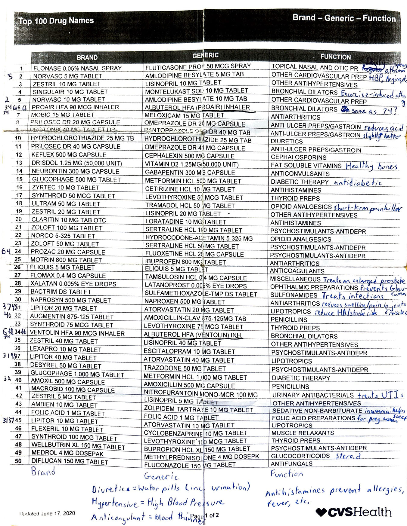
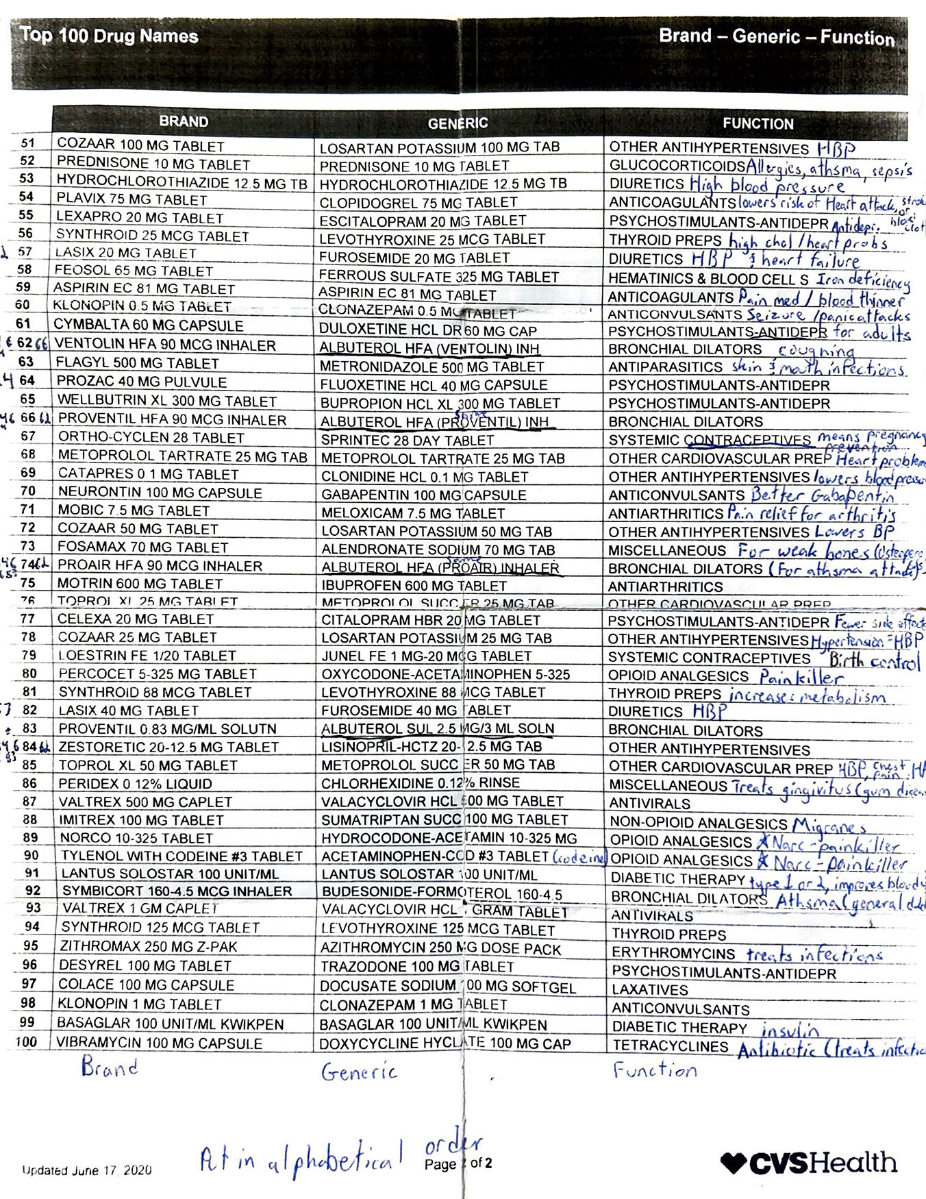
The problem with this list is that:
- The item you’re looking for is very hard to find.
- Most people wouldn’t understand the “FUNCTION” description.
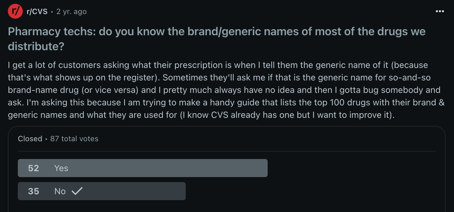
I submitted a poll to the r/CVS Reddit page to see if other pharmacy technicians had the same struggles as I did. While the user profiles cannot be verified, it intrigued me to see how many others weren't fluent in brand drug name to generic drug name translation.
My goal: create something that if asked at the drive thru “what does that do?”, I could step away, check my chart and have a very basic answer within roughly 10 seconds.
How I made it
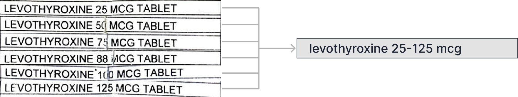
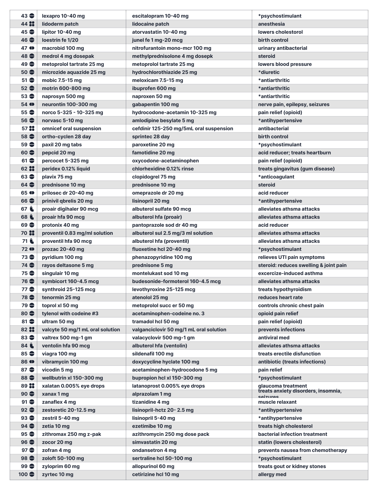
1. Consolidated duplicate-listed drugs
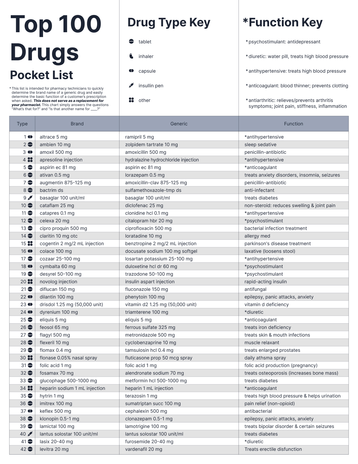
I began by reorganizing the drugs listed in the CVS Top 100 Drug Names list. I inputted the data into a spreadsheet and sorted the list by alphabetical order.
I first noticed there were duplicate drugs in the chart of varying strengths. Being that they all had the same function, I condensed these duplicates to one row each and added in a few common drugs recommended by my pharmacist.
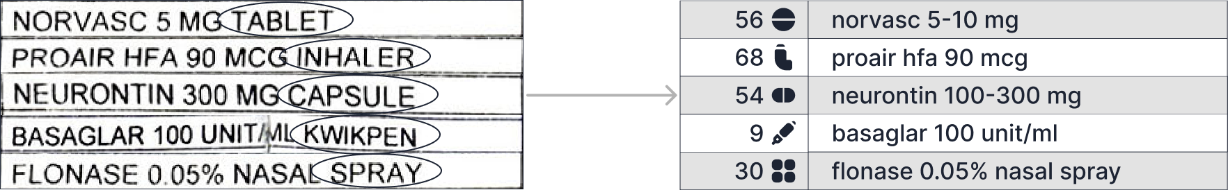
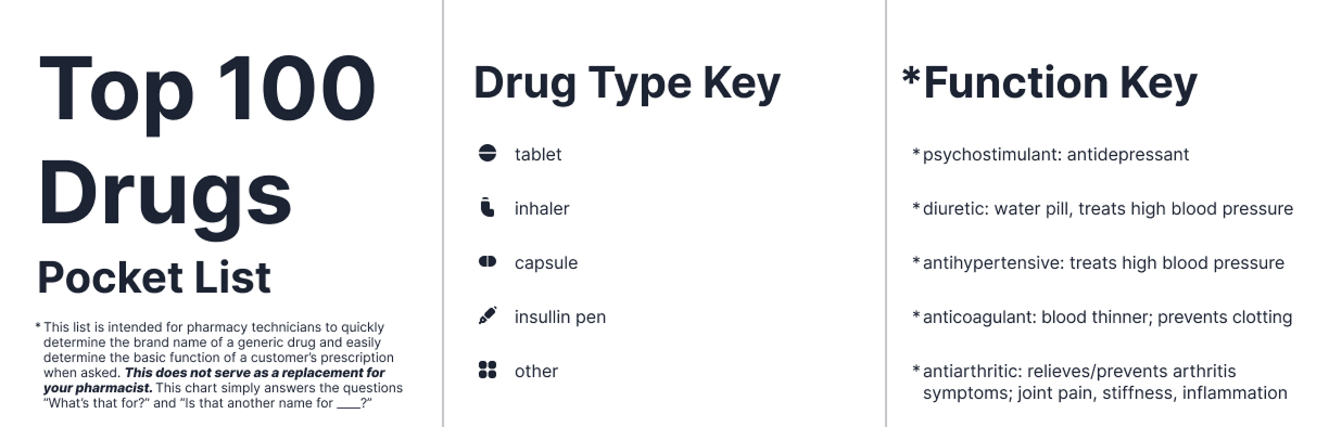
2. Used icons to indicate drug types
Next, I noticed that the prescription names would be followed by “TAB”, “CAP”, “SOLN” or something to indicate the drug type. This added characters to the name which was redundant, not scannable, and took up precious space, so I replaced that text with icons instead.
3. Simplified the "FUNCTION" description
Then, I noticed a lot of drugs had the same “FUNCTION” description. Their descriptions were either too vague or too pharmaceutical for most people casually picking up their prescriptions to understand so I rephrased them in a more digestible way, reviewed & verified by my pharmacist.
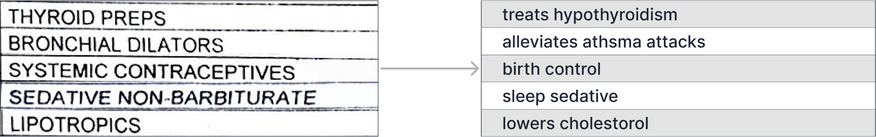
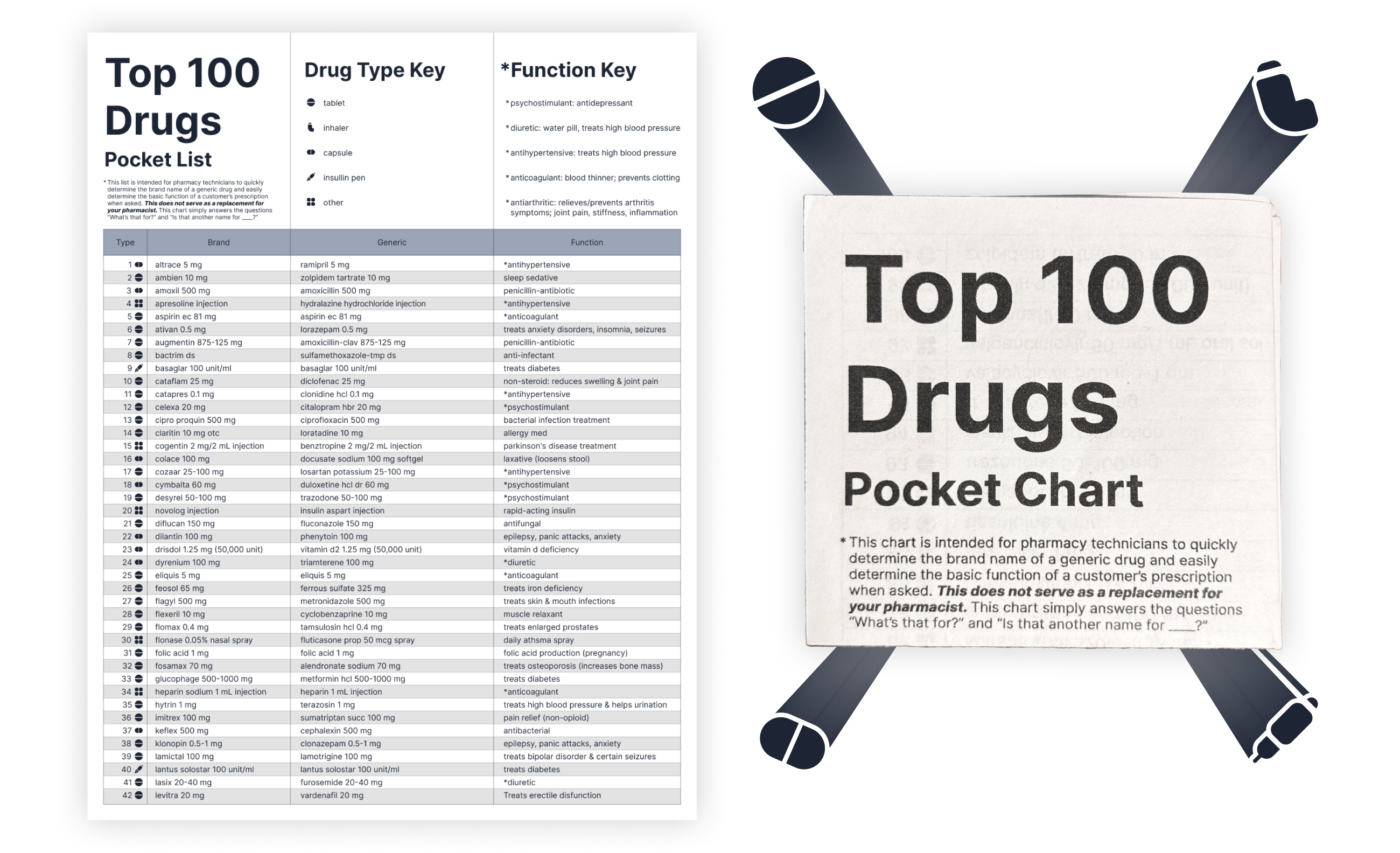
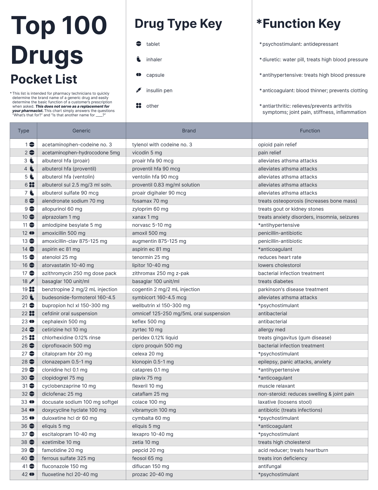
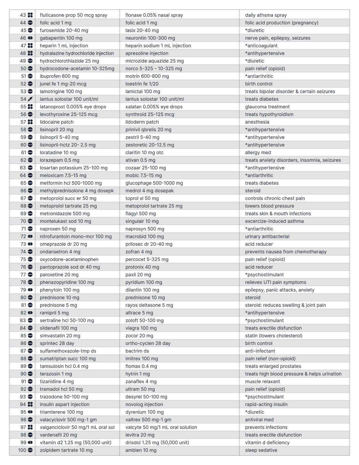
I included a title and keys at the top of the page with a description/disclaimer that this chart is NOT meant to replace your pharmacist. I also included a key for the drug type icons and the function key to define recurring pharmaceutical words that I decided to keep from the CVS list since they came up so frequently.
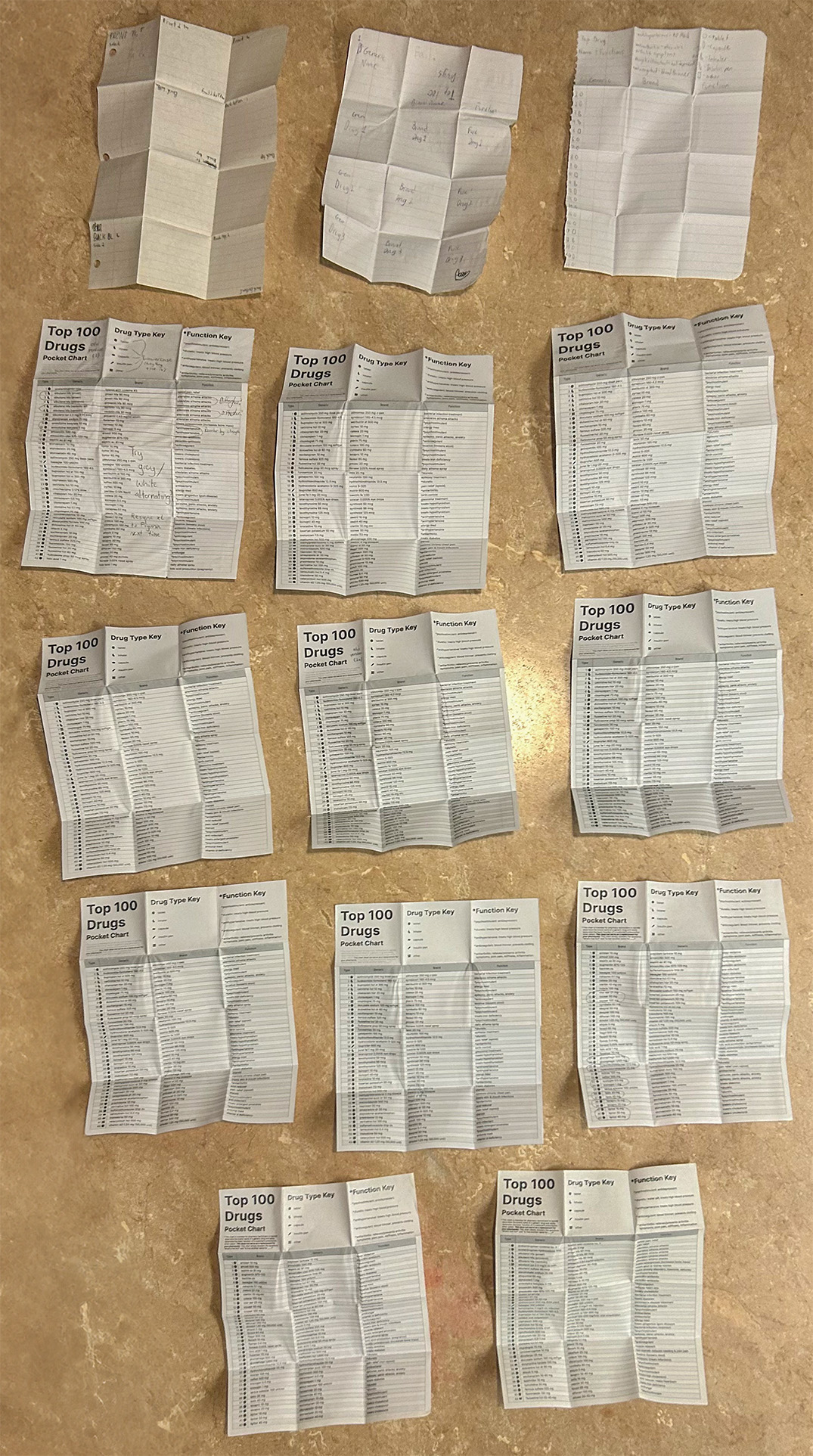
Print iterations
I created 14 different versions of my design before it was finalized- starting with looseleaf paper to figure out the way the paper should be folded.
Final Designs
Generic name alphabetical
Brand name alphabetical
Folding tutorial
Explore More Creations ↓

Looking for full-time Product & UX Design opportunities!
© 2025 John Curley Design
