A storytelling app helping people experience the history and culture of the Finger Lakes Region.
Skills
User Research
UX Design
UI Design
Prototyping
Timeframe
8 months
(May - Dec 2024)
Tools
Figma
STQRY
Zapworks Mattercraft
Notion
Team
John Curley - UX/UI Design
Sheryl Wang - UX/UI Design
Heather Shields - Brand Design
Summary
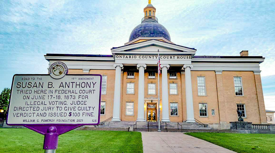
Finger Lakes Virtual Museum is a 24/7 virtual museum for the Finger Lakes region. At each historic site marked by a sign, visitors can access a QR code that presents an exciting experience utilizing photos, videos, AR, and most importantly, fascinating history.
As a UX designer, I created the app’s information architecture, identified our target users, and designed the app’s interface based on user testing.
Opportunity:
Increase the awareness & engagement of historical sites.
Solution:
Create interactive experiences that make history more engaging, educational, & memorable.
Research
Comparative / Competitive Analysis
Understanding our competition & software
This app was created using STQRY; a no-code tourism app builder. To learn more about the capabilities of our tool and to see what succeeds and fails with existing tour apps, we conducted comparative/competitive analysis.
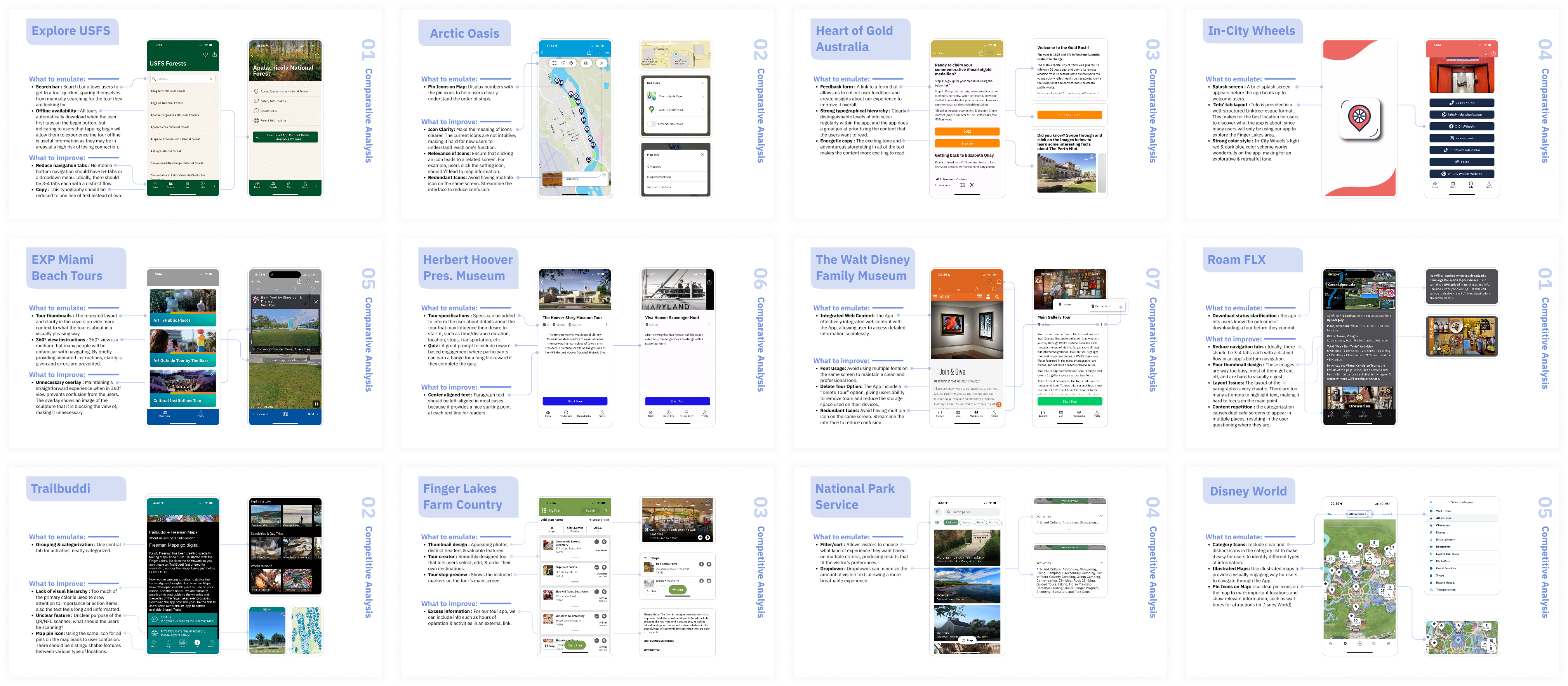
Comparative analysis- STQRY based apps. Competitive analysis- not STQRY based apps
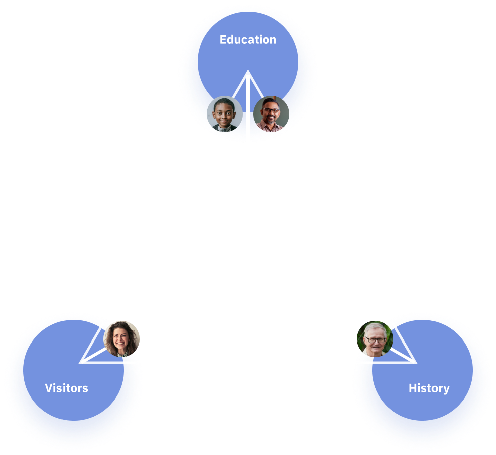
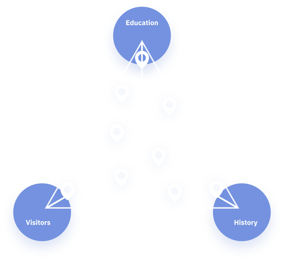
Who are our target users?
Tourists & Visitors
In 2018, the Finger Lakes Region had 5.56 million visitors, most of whom were “leisure visitors.”
(Ithaca Times)
Students & Teachers
4th, 7th, & 8th grade NY history classes are based on state & regional history.
(NYS K-12 Studies Framework)
History Aficionados
There is opportunity to foster a community of collaboration and networking amongst local historians & sign owners participating in this project.
Understanding the need to cater to multiple audiences, we came up with a way to visualize the three primary themes of our target users: K-12 education, history aficionados, and Finger Lakes visitors.
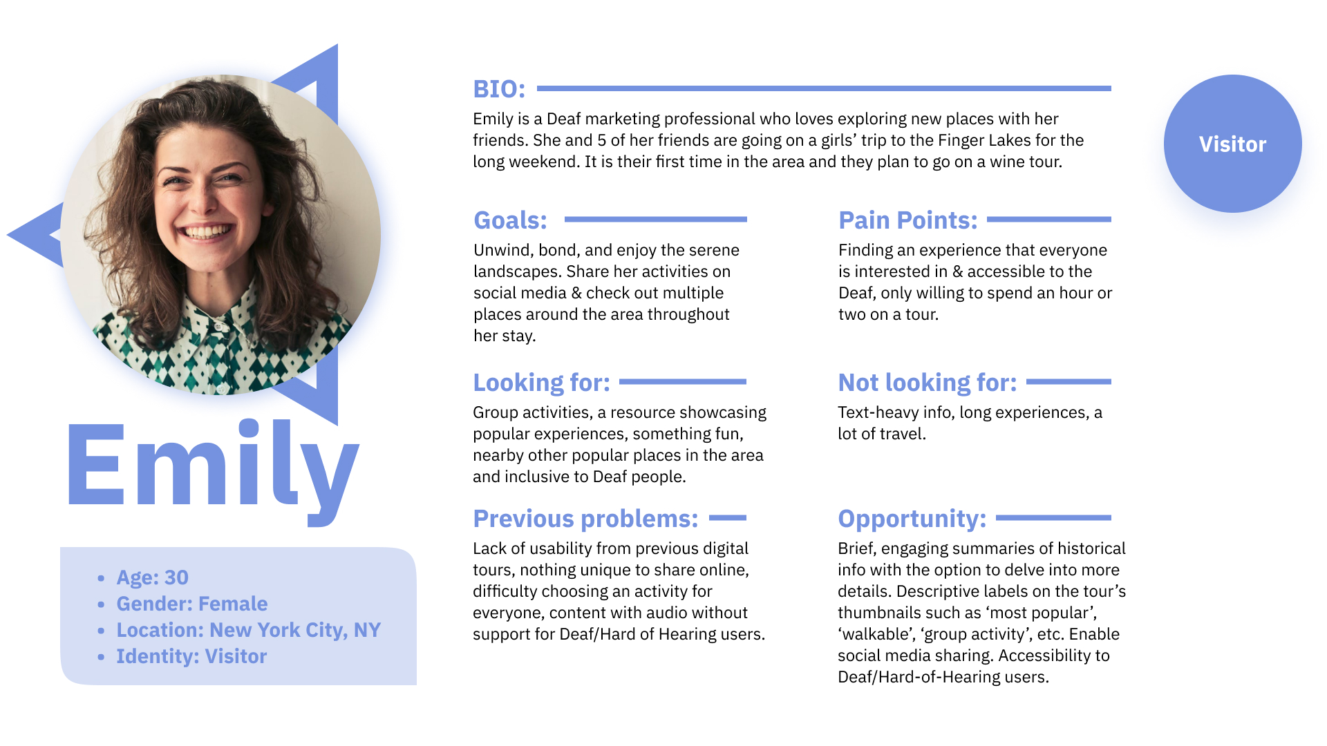
User Persona- Emily (Visitor)
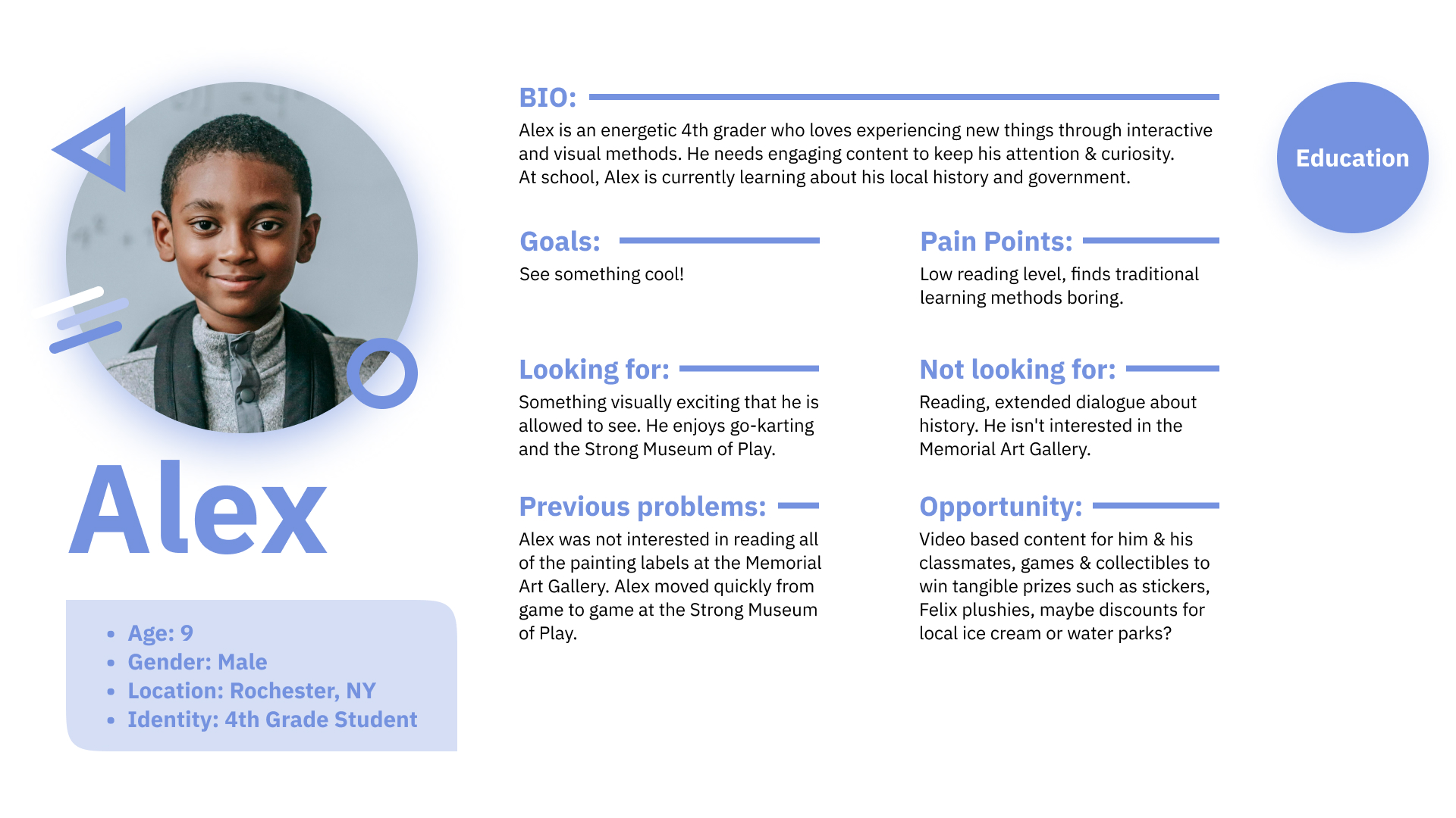
User Persona- Alex (Education)
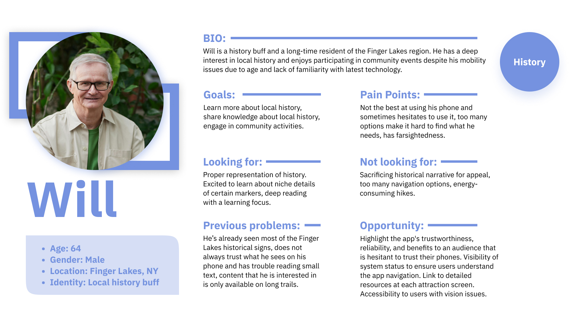
User Persona- Will (History)
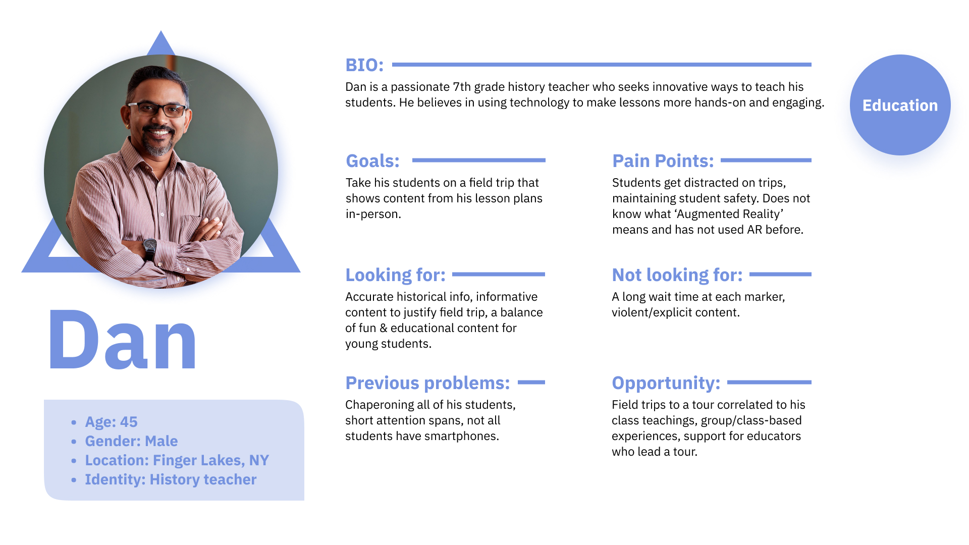
User Persona- Dan (Education)
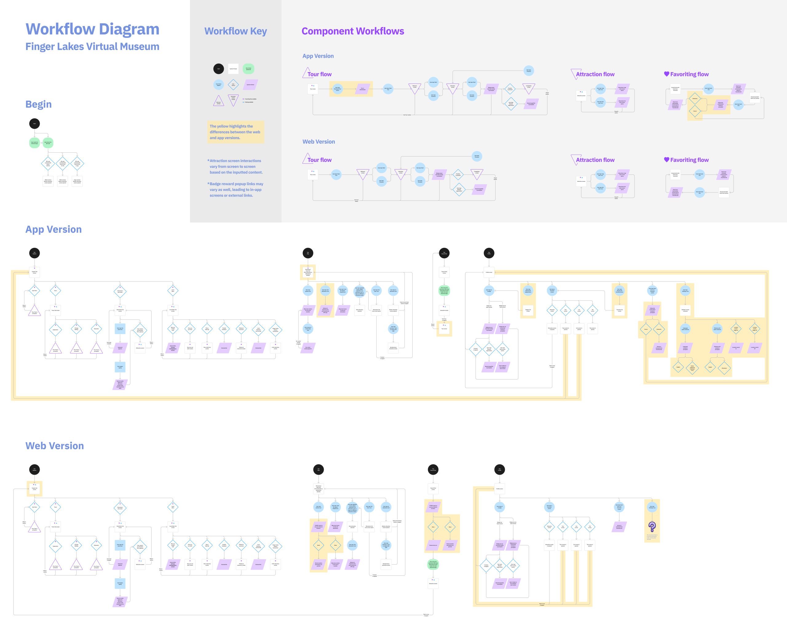
Workflow Diagram
Native App vs. Web App
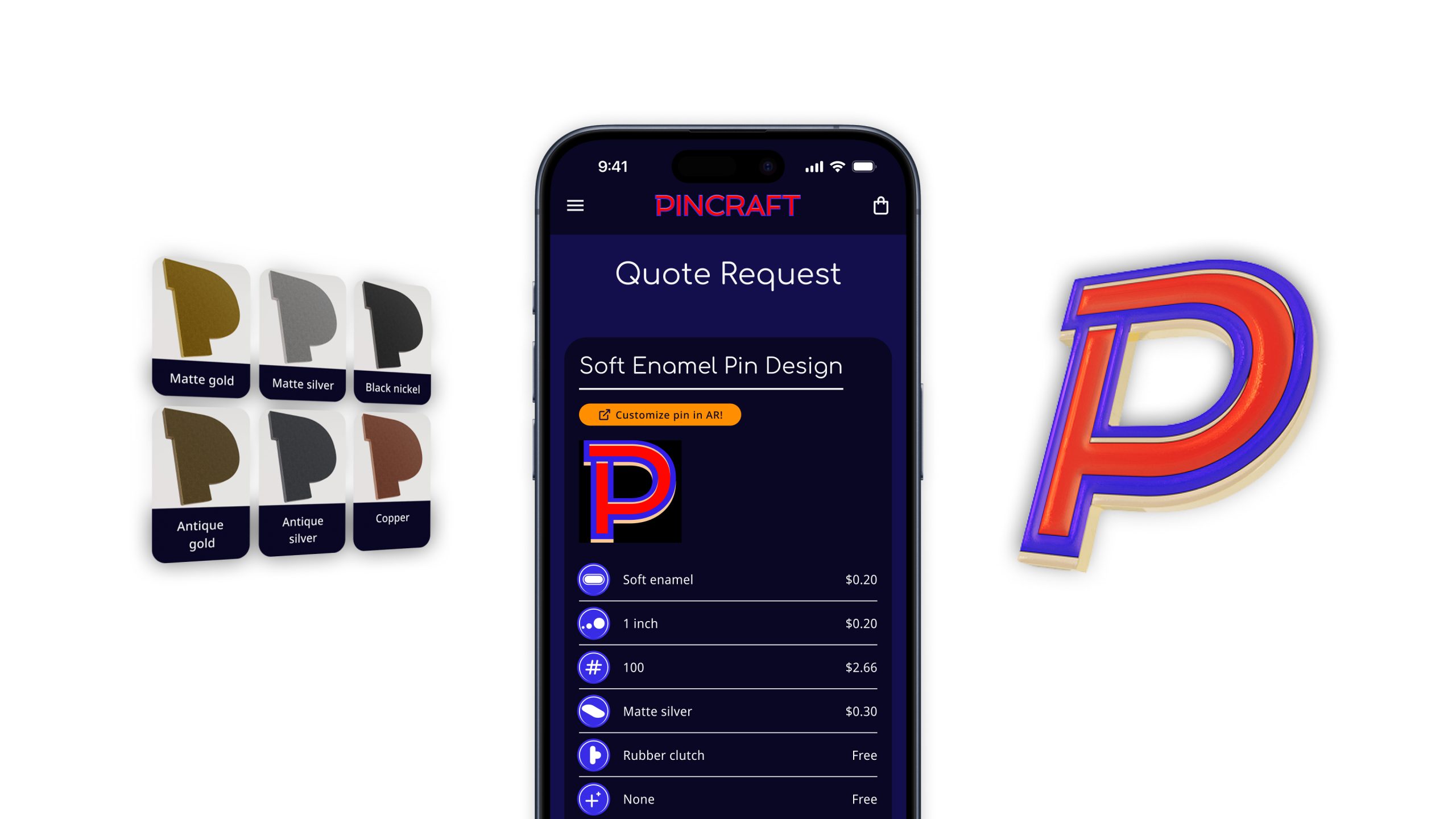
This diagram maps the app's architecture and screen interactions on both the web and native versions. This maps out the structure of content for our app & accounts for the differences on each platform (highlighted in yellow).
Creation
User Testing
We interviewed 9 user testers to try out 6 of our digital attraction experiences, all of which feature AR content:
Age:
All over the age of 60.
Digital confidence:
Not at all confident: 1
Just okay: 2
Sort of confident: 3
Very confident: 3
Experience with AR:
Never: 4
Once or twice: 4
Many times: 1
Main Insights:
They loved learning something new
“I learned about [Elizabeth Blackwell] - she was a pioneer for women!”
“Naples Fossil Tree was something I didn’t know about.”
“The different links connected to events.”
Struggles with AR
“Needed prompting” for placing & locating images in 3d space.
AR Images were not readable.
‘Place’ button was cut off at times.
Improvements
1. Human-centered AR design
All AR experiences now have a sequence of UI patterns- such as a splash screen, instructions, CTA buttons, & more.
2. Unique map markers for each attraction
Instead of having several identicle markers on the map, giving each a unique icon allows for more distinction amongst attractions to viewers looking at the map.
3. Linking the tour at every attraction footer
Rather than just being a still image, this button inow links to the respective tour of the attraction a user is currently viewing.
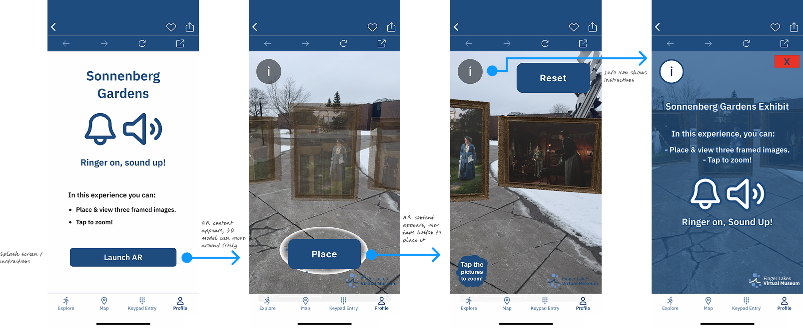
Design improvements to an AR experience flow
Old map icons (top) vs. new map icons (bottom)
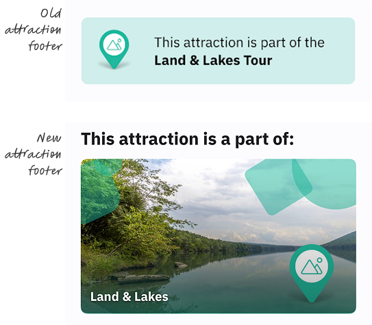
Old attraction footer vs. new attraction footer
Final Designs
Final Flows
1. Go on a tour
The best way to discover and learn more about a Finger Lakes topic that intrigues you. View 9 tours that will take you all across Ontario County.
2. View an AR attraction
See a sign, scan a sign! Attractions are designed to elighten and entertain any & all passerbys.
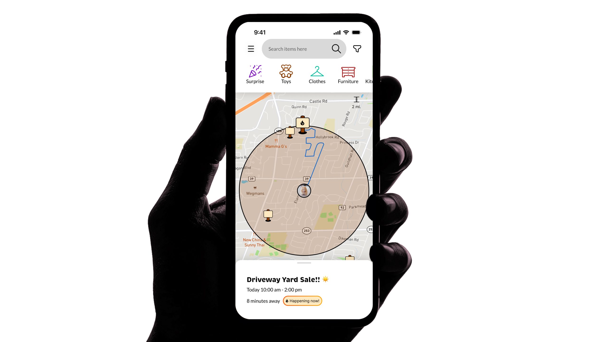
3. Explore the Attraction Map
Know what you're looking for when it comes to attractions; all color-coded by Tour and uniquely labeled by icon.
1. Learning Legacies tour
2. Sonnenberg Gardens AR attraction
3. Attractions map
Conclusion
Takeaways
1. Test on all devices & platforms!
There were so many small but impactful differences that I discovered by testing on different devices & platforms. Sometimes I would implement a design decision that looked great on one device, only to realize later on that it was different or didn't work on another device, causing us to have to redecide.
2. The Five Why's theory
At one point, I felt lost after realizing our user personas were all over the place. I tried the Five Why's theory written about in Don Norman's "Design of Everyday Things" book. This technique led me to conclude that while our product is available & should be accessible to everyone, it is crucial to make design & marketing decisions to win over our target audience.
3. Speak with users very early
Instead of mostly relying on the input from our clients about user insights, I believe we would've had even better insights if we had conducted surveys and interviews with the public audience in the beginning stages of our user research. We could have then done affinity mapping to help us identify and organize our users more definitively.
Explore more Selected Work ↓
Looking for full-time Product & UX Design opportunities!
© 2025 John Curley Design
