Researched, analyzed, & prototyped a concept for a more engaging, prideful, & easier-to-use version of www.cityofrochester.gov.
Skills
User Research
UX Design
UI Design
Prototyping
Timeframe
2 months
(Fall 2023)
Tools
Figma
Adobe Illustrator
Adobe Photoshop
Team
Solo Project
Summary
Rochester, NY, is a city filled with innovation and culture. In 2023, their website cityofrochester.gov that over 200,000 citizens rely on for resources, updates, and much more was in need of major change in order to not only meet but exceed modern web standards.
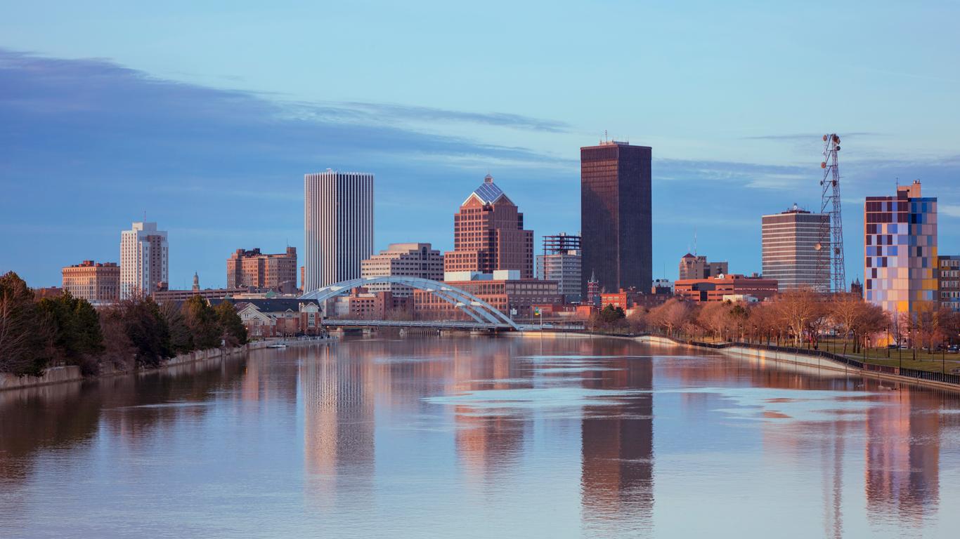
(Roland Shainidze Photogaphy)
Opportunity:
Revitalize www.cityofrochester.gov to exceed modern web standards.
Solution:
Create a template for 1st & 2nd page levels, simplify user’s search for information, give more space to the UI, and improve the Rochester look & feel.
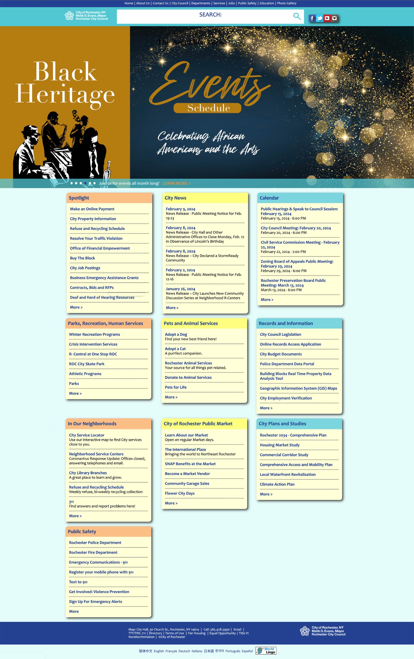
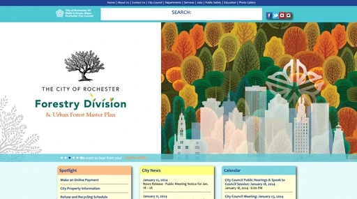
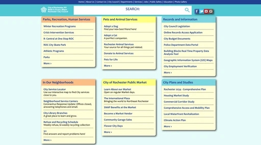
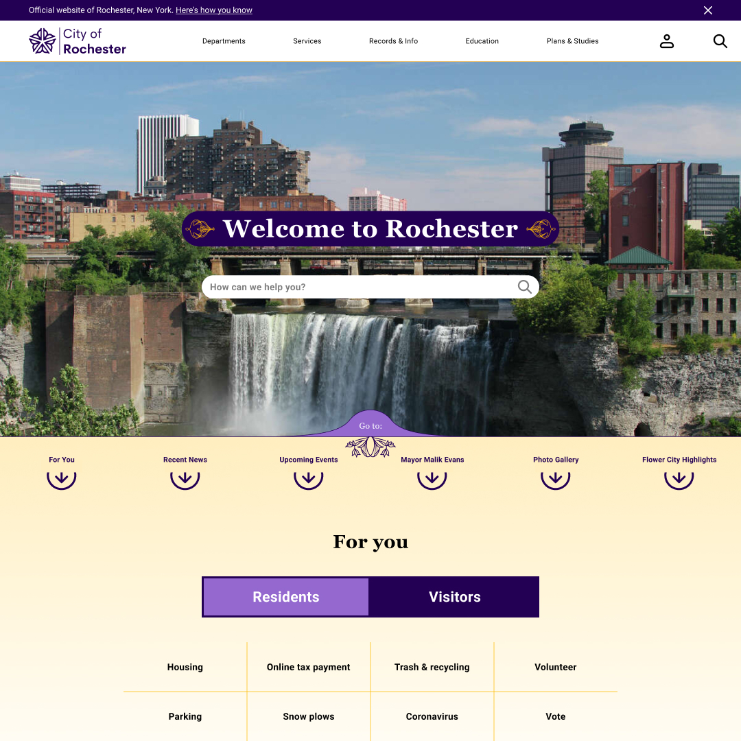
Before:
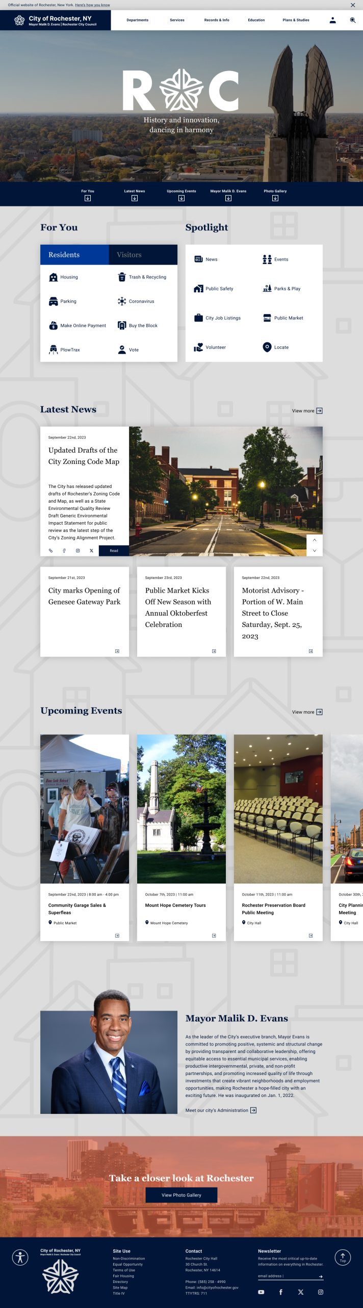
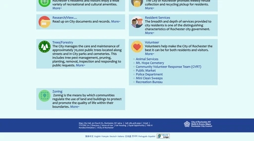
After:
Research
Through my preliminary analysis, user survey with 6 Rochester locals, and my discussion with the website's Director of Communications and Digital Content Manager, here are the four main pain points I discovered.
Pain points:
Lack of visual hierarchy
Outdated visual style
Inconsistent design system
Confusing & complicated user flows
Comparative Analysis
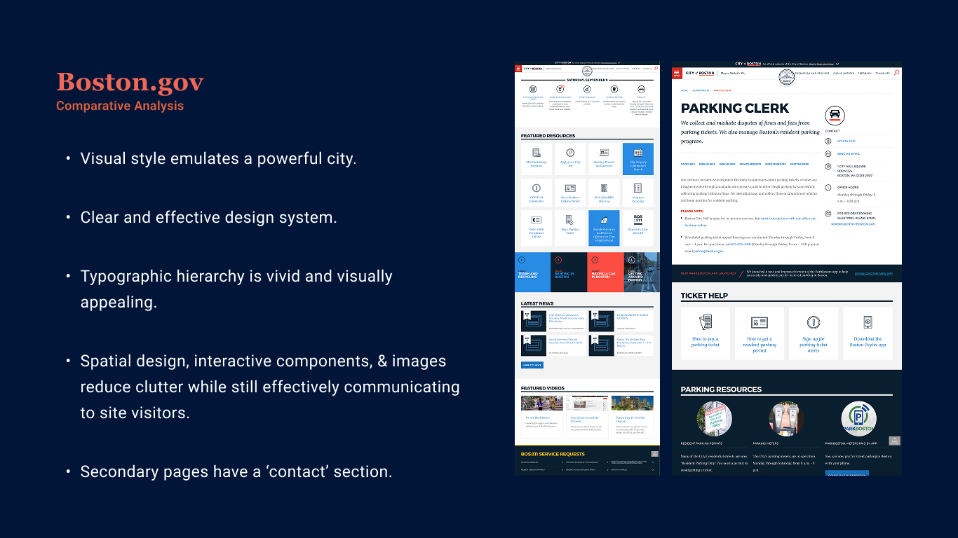
Comparative analysis- Boston.gov
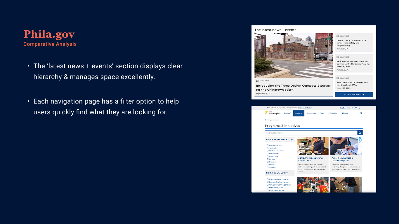
Comparative analysis- Phila.gov
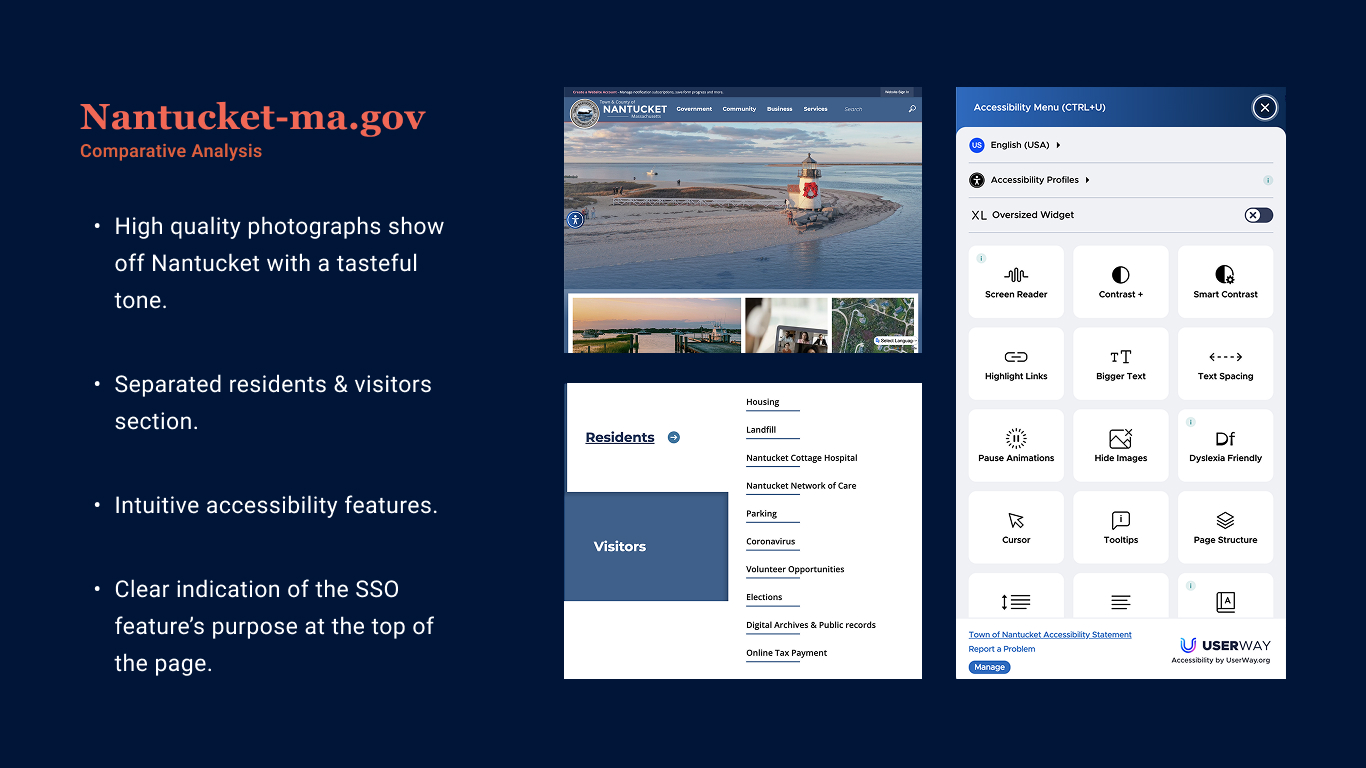
Comparative analysis- Nantucket-ma.gov
Creation
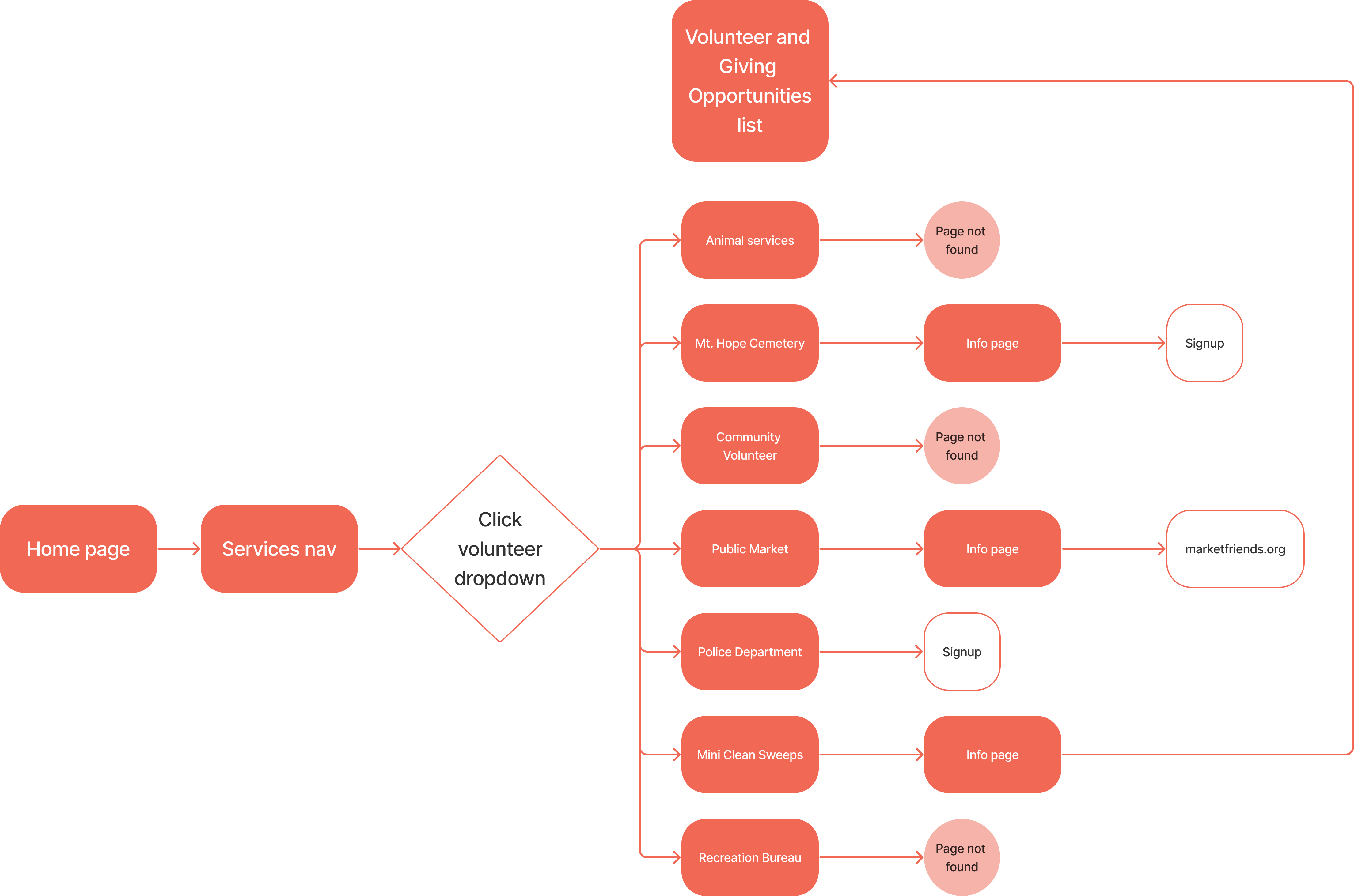
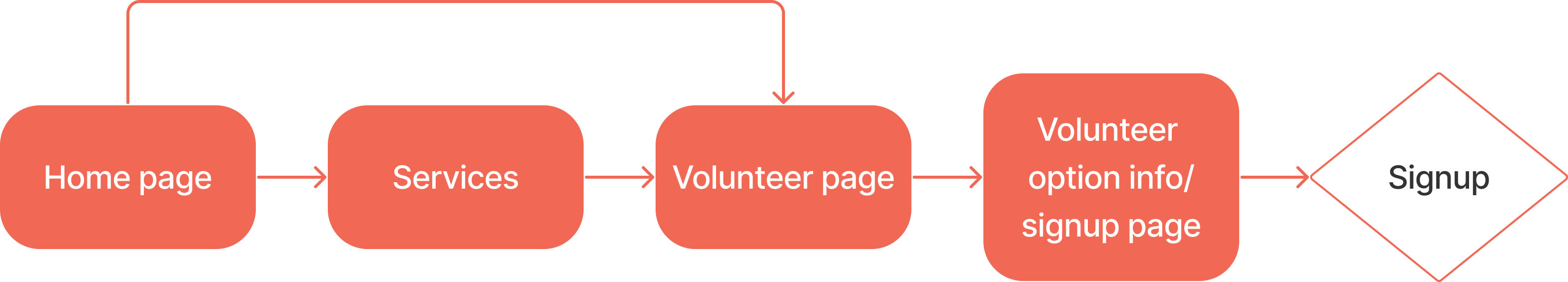
Simplifying the user flow
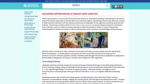
I created a template for 1st and 2nd page levels to simplify the user's search for information. I remade a user flow of someone looking for more volunteer opportunities around Rochester.
Old 'volunteer' flow
New 'volunteer' flow
Iterating the layout
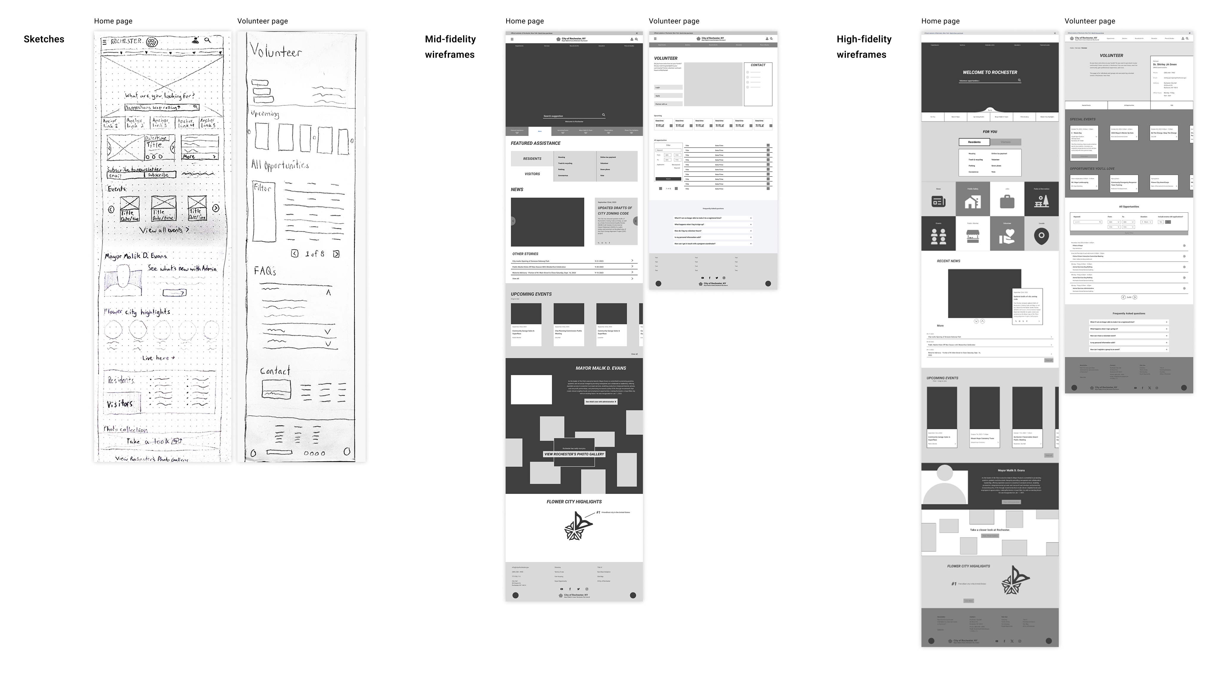
I worked through several levels of fidelity to design a layout that prioritizes a consitent hierarchy, provides proper spacing, and reduces clutter.
Sketches & Wireframes
Visual Style
To help make the redesign feel more 'Rochester,' I created 2 different mood boards that encapsulate two different tones of the city. From these moodboards, I created two Above the Folds based on the respective style.
Corporate Brutalist
Tall, rectangular, angular. Tertiary colors used as highlights on a neutral background. Inspired by Rochester's architecture.
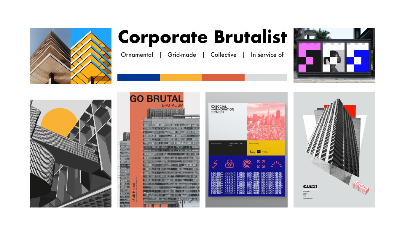
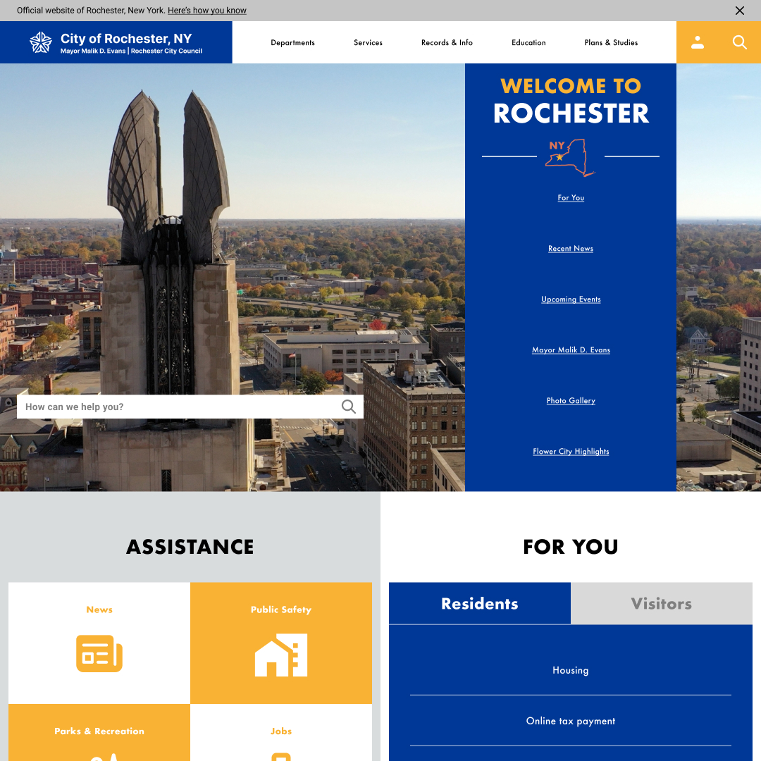
Above the fold: Corporate Brutalist
Flower Festival
Purple & gold, sunny summer vibe. Light, decorative & illustrative. Inspired by Rochester's annual summer Lilac Festival.
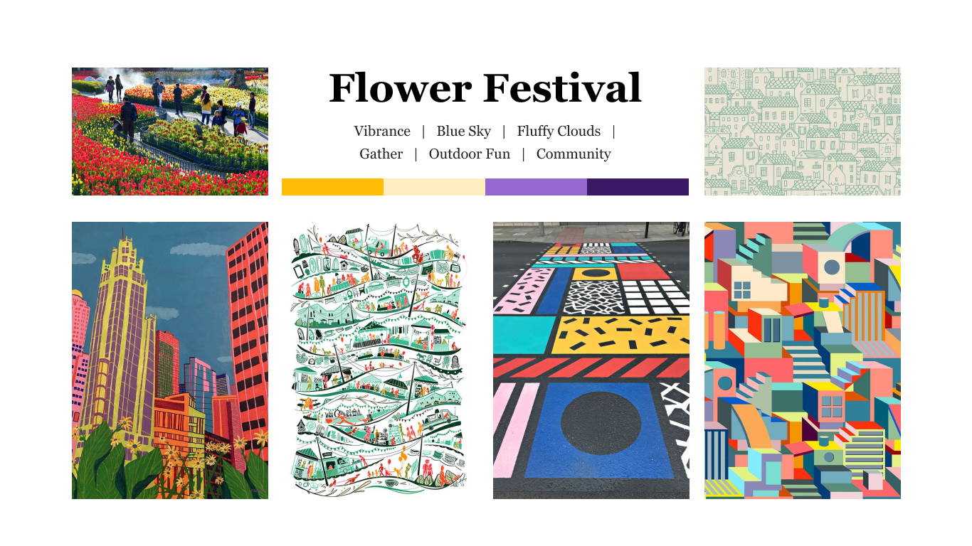
Above the fold: Flower Festival
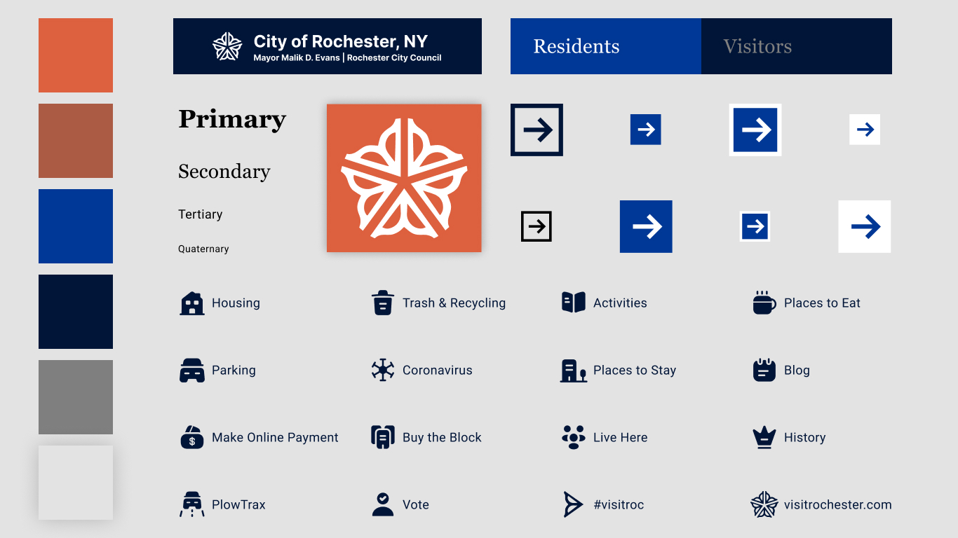
Final Design
A style guide that screams "Rochester!"
- Solid-colored, sharp-edged, vertically stretched features portray innovation and urban-ness.
- The pairing of the blues and the serif “Georgia” primary & secondary typeface makes for an official, secure, & trustworthy tone.
- The highlight red grabs viewer’s attention towards the most important parts of the site.
- This unique color combination can become a recognizable attribute of Rochester culture.
Final website redesign
Home page
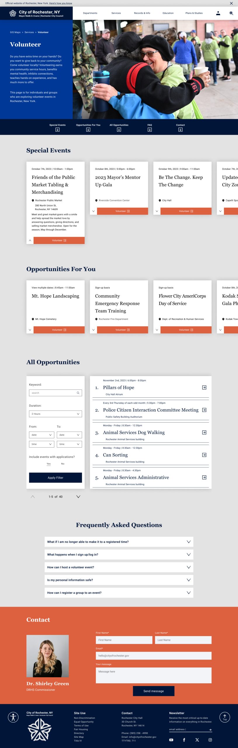
Volunteer page
Video walkthrough
Conclusion
My biggest takeaway:
Shaping my project goals around dynamic user research
I did my own personal assessment of www.cityofrochester.gov, discussed website objectives & audiences with members of the city council, and conducted my own public user survey. Talking with Barbara Pierce (Director of Communications for ROC) & Matt Driffill (Digital Content Manager) exposed me to the core objectives of the website which are to engage, connect, and inform for city residents, property/business owners, visitors, and even people in surrounding counties. My user survey allowed me to survey real use cases with the site which exposed me to experiences, pain points, and ideas that I would've never thought of alone. By collecting information from a plethora of resources, I was able to assess multiple perspectives to make the best-informed decisions.

Explore more Selected Work ↓
Looking for full-time Product & UX Design opportunities!
© 2025 John Curley Design
